Case Interview Graphs and Charts Guide
Read case interview charts faster with a repeatable exhibit workflow, worked examples, chart-type traps, and a Road to Offer graph drill.
On this page
Case interview graphs and charts test a narrow skill: can you turn an exhibit into a decision-relevant insight under time pressure? Read the title, axes, units, legend, and footnotes first. Then state the pattern, the exception, and the business implication in that order. Bain's case interview advice emphasizes clarifying the objective and highlighting important numbers, while McKinsey describes case interviews as a way to test analytical thinking in a client scenario. The exhibit answer should sound like client work, not chart narration.
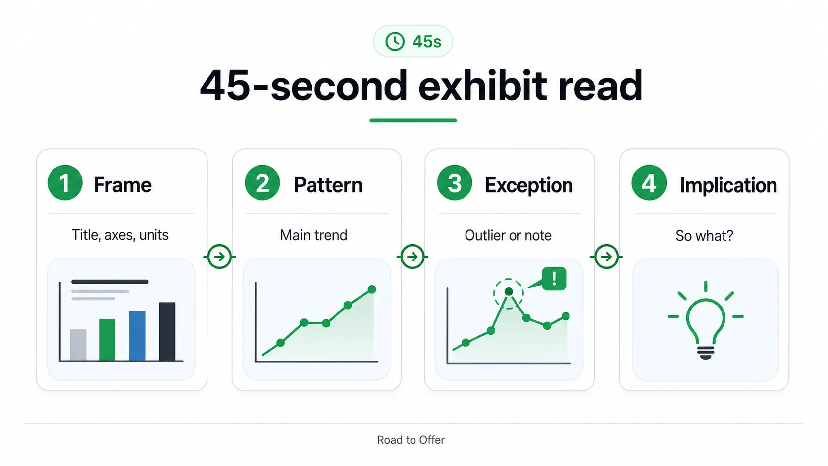
Use the 45-second exhibit read
The fastest candidates follow a fixed reading order instead of hunting for the biggest number. Statistics Canada's data visualization guidance treats titles, axes, notes, and sources as core chart components, and the U.S. Web Design System recommends that data visuals state the intended message clearly. In an interview, copy that discipline: identify the frame before interpreting the visual.
This same sequence also protects you from the classic unit mistake. A 6 percentage point margin increase is not the same as a 6 percent increase in margin. A chart in thousands is not a chart in millions.
Read each chart type for the thing it is built to show
Each exhibit type has a job. The candidate error is forcing every exhibit through the same read. Pair this section with the broader case interview data interpretation guide when you want the full analysis workflow.
Waterfalls often show up in profitability cases. Scatter and bubble charts are common in portfolio, pricing, and growth prompts. Tables appear anywhere the interviewer wants accuracy more than speed.
Worked example: a subscription app exhibit
Imagine the client runs a paid fitness app and is considering whether to spend more on paid acquisition. The interviewer gives you this simplified exhibit:
Weak answer: "Search ads have the most new users, and referrals have the highest conversion."
Strong answer: "I would not scale search first. Search has volume, but referrals look more attractive because they combine the highest paid conversion, lowest churn, and lowest acquisition cost. The client should test whether referrals can scale beyond 10,000 users before adding more paid media."
The strong answer uses only a few numbers. It wins because the implication is clear.
Say the insight like a consultant
Interviewers do not need a tour of the chart. They need the point. Use this sentence order:
- Implication: "This exhibit suggests we should prioritize channel A."
- Evidence: "It has the best conversion, lowest churn, and lowest CAC."
- Caveat: "The risk is scale, since current volume is only 10,000 users."
- Next step: "I would test referral capacity before committing budget."
Bain's official case guidance tells candidates to clarify the objective, structure thinking, think aloud, listen, adapt, and emphasize key numbers. That is exactly the behavior this answer shows.
Practice a Road to Offer graph drill
Reading about chart types is not enough. You need timed reps where you have to say the so-what before the perfect answer is obvious. Run one graph drill below, then continue with more exhibit reps in free case interview drills.
Fix the 6 chart mistakes that cost points
Narrating labels
If your first sentence is just a label, you are delaying the answer. Replace "Revenue rose from 2023 to 2025" with "The client has a digital-led growth opportunity."
Missing the base
Percentages need a denominator. A small segment doubling can still be less important than a large segment growing 5%.
Mixing units
Check whether the visual uses dollars, units, percentage points, index values, or customer counts. Many exhibit errors come from comparing unlike measures.
Ignoring notes
Notes often define exclusions, time periods, and calculations. Statistics Canada's guidance treats notes as a place for methodology, data limitations, and abbreviations, which is exactly why interview exhibits use them.
Overclaiming causality
A scatter plot can suggest a relationship, but it rarely proves causality by itself. Say "this suggests" unless the case gives evidence for cause.
Forgetting the case question
An exhibit answer only matters if it advances the case. Tie every chart insight back to the objective, whether that is entering a market, fixing profit, pricing a product, or choosing a growth lever.
Build a chart practice loop
Use this 15-minute loop when chart reading feels slow:
- Pick 3 exhibits from a casebook or Road to Offer drills.
- Spend 45 seconds on each exhibit.
- Say 1 implication sentence and 2 evidence points out loud.
- Check the axis, unit, footnote, and source after answering.
- Log the miss: frame, pattern, exception, or implication.
For adjacent reps, use case interview math practice, market sizing step by step, and the consulting toolkit bundle. If you want full-case pressure after exhibit reps, start a free case at Road to Offer.
Sources and Further Reading (checked 2026-06-08)
- Bain & Company - Preparing for the Case Interview
- BCG Careers - Case Interview Preparation
- McKinsey & Company - Interviewing at McKinsey
- Yale Office of Career Strategy - The Case Interview
- Statistics Canada - Data Visualization: Best Practices
- U.S. Web Design System - Data Visualizations
- Case interview data interpretation
- Case interview math practice
- Market sizing step by step
FAQ
Frequently asked questions
Keep reading
Related articles
Reading Charts and Exhibits in Case Interviews
How to read charts, graphs, and data tables in case interviews. Covers exhibit types, common traps, a 4-step reading method, and worked examples under time pressure.
Case Interview Checklist and Rubric Prep
A practical checklist for mock cases, before and after each rep, so you can turn a vague practice session into specific rubric-based feedback and targeted drills.
Case Interview Communication: How to Think Out Loud
Learn how to verbalize your thinking in case interviews. Covers signposting, structuring spoken answers, managing silence, and the communication habits top candidates use.
Data Science Case Interview: Complete Prep Guide for BCG X, McKinsey QuantumBlack, and Bain Vector (2026)
Master data science case interviews at BCG X, McKinsey QuantumBlack, and Bain Vector. Covers ML framing, A/B testing, product analytics, and a 30-day prep plan.